A 116-year-old Idaho landmark gets a refresh. Earlier this year, a good friend passed my name and recommendation along to the Children’s Home. They were looking for a creative partner to refresh their visual identity and hone their brand’s perception. It was a privilege to be trusted with this task. The work the Children’s Home has done over the last 116+ years to help their clients and families is truly important.
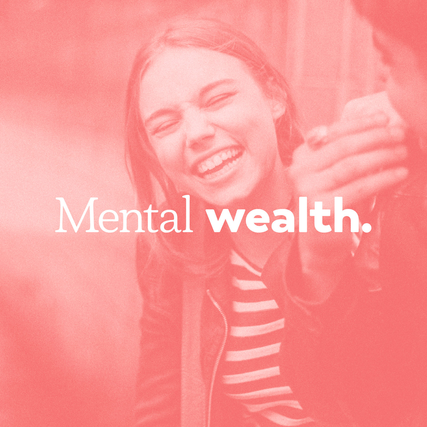
My role: Create a new visual identity system and refreshed brand that breaks the stigma of mental health. The result not only needed to feel appropriate for the youth they serve, but also be professional and respectful to the history of the Children’s Home.
The process.
This project had several moving parts, but three things stood out as critical elements to the project’s success:
Name—a name change was needed to remove confusion and add clarity
Logo—a new logo to serve as the brand’s cornerstone visual element
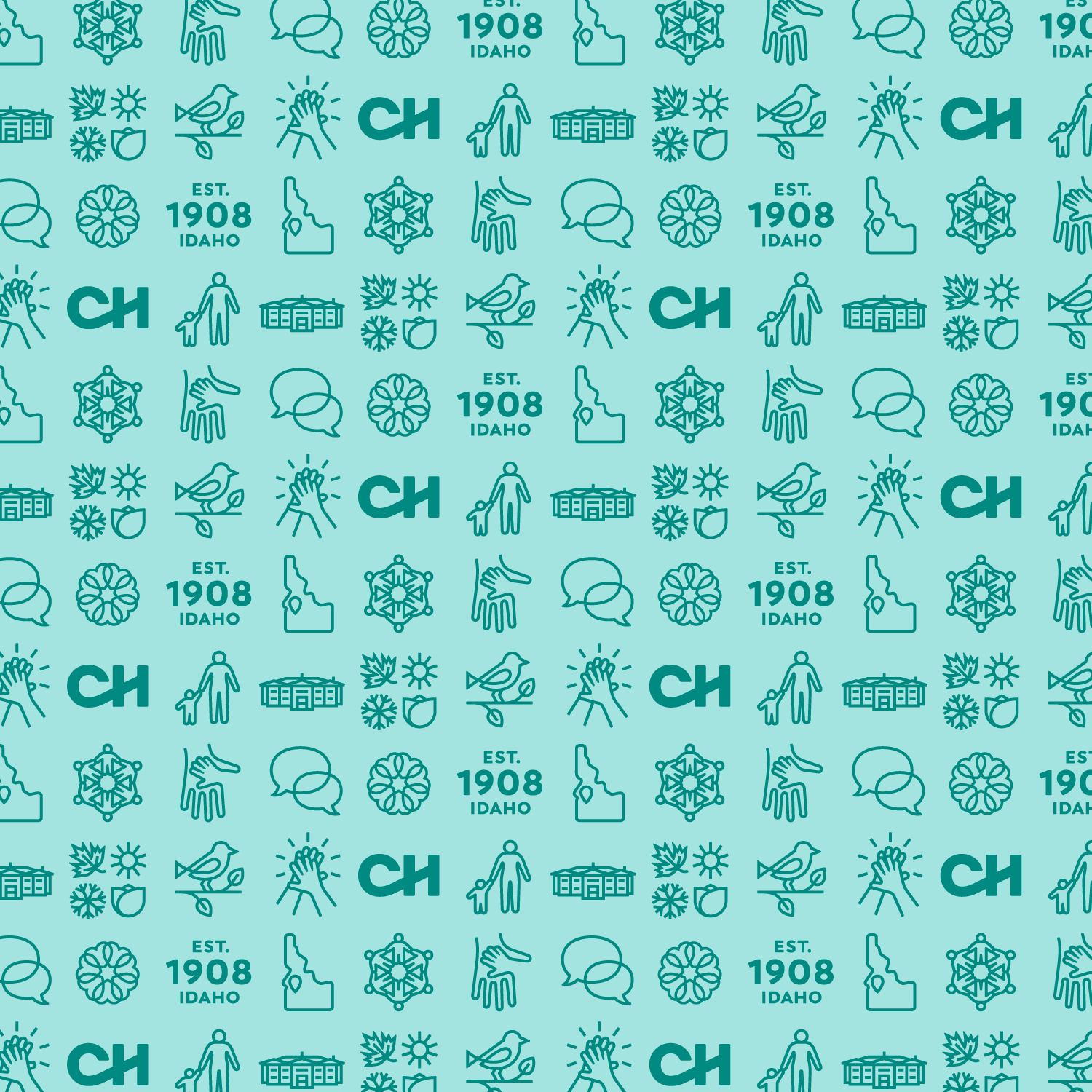
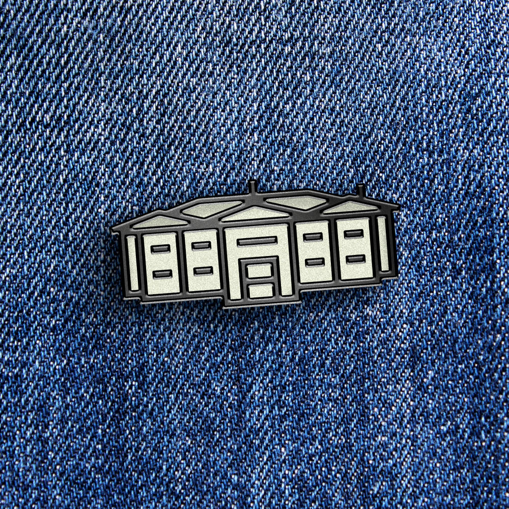
System—a dynamic design system to take the brand beyond the logo
Changing the name.
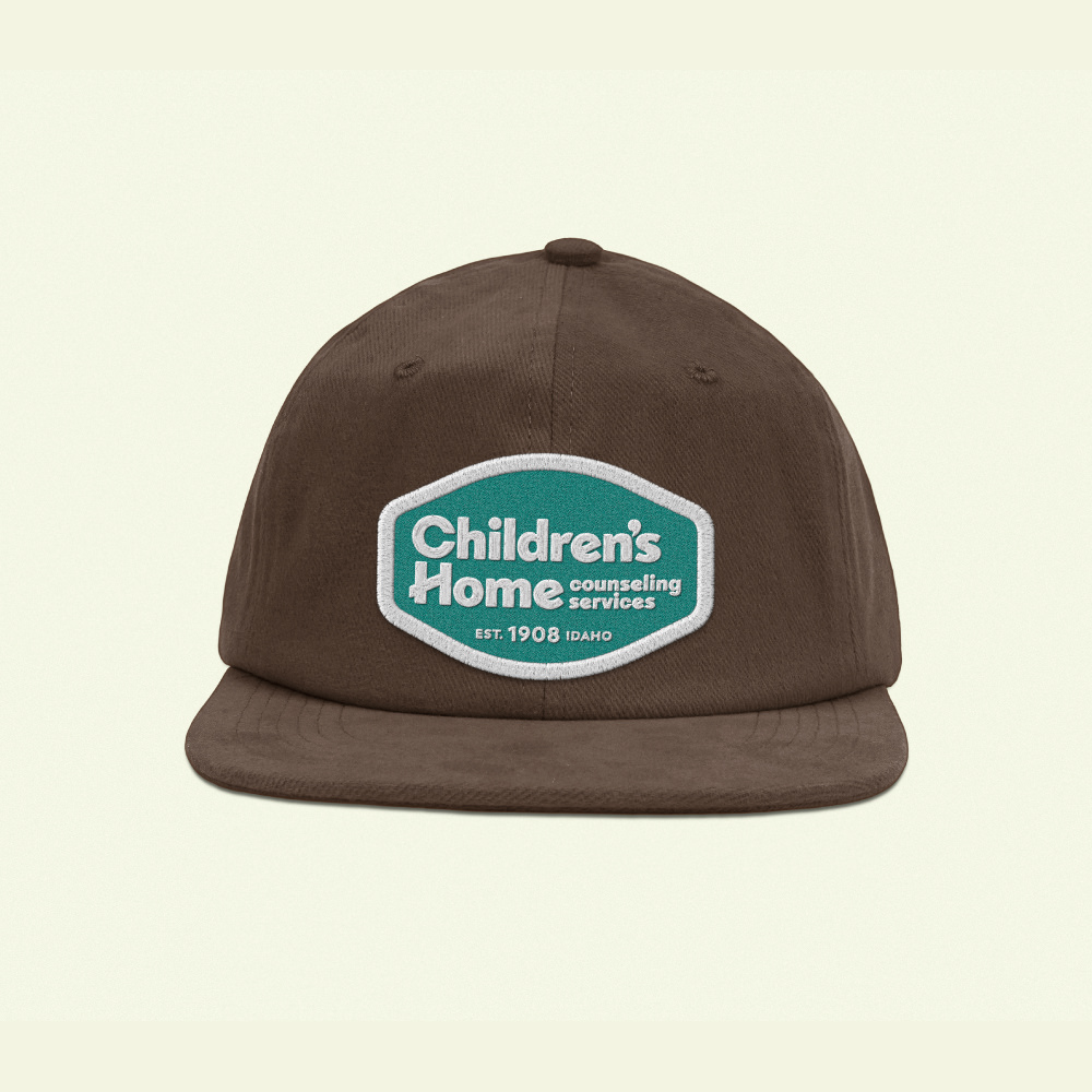
The “Children’s Home Society of Idaho” is a mouthful. In addition, there were also the “Warm Springs Counseling Center” and “Warm Spring Training Institute” subbrands. For those outside the organization, it could be confusing. It was time to simplify and shine light on the services the they offer. To most, the Children’s Home Society of Idaho is commonly referred to as the “Children’s Home.” Thus, making it the obvious name to move forward with. Additionally, more clarification was needed on what services they offer. The final naming solution was “Children’s Home,” followed by “counseling services” at a much smaller size to clarify what the Children’s Home does for the community today.
Wordmark only.
From the start of this project, we knew we wanted the new logo to be a custom wordmark. This design choice would keep things simple and avoid common pitfalls encountered with logomarks (icons in logos). The counseling space is plagued by the overuse of generic imagery like holding hands, silhouettes of children, and stylized trees. In contrast, some designs can be so abstract that viewers have no idea what they’re looking at. And if you have to explain a design, it isn’t clear enough. Because of this, a workmark was a great strategic choice. Though we were moving forward with a wordmark-only logo, Icons and other visual elements would be incorporated into the design system later in the process.
Filter Categories
Filter - All
Filter Categories
Filter - All
The solution.
After exploring several possible directions, we moved forward with a custom sans-serif option. The design utilizes soft corners to give a friendly and age-appropriate feel and is slightly overweighted to separate it further from others in the clinical space. The wordmark uses angles that carry through the “H” and “e”s to add playfulness and tie to the angle of a roof/home—without being too literal. The chosen direction also deliberately typesets “counseling services” in lowercase to help give stylistic prominence to “Children’s Home.” Lastly, the asymmetric stack enables a smaller logo footprint and easily lends itself to a secondary lockup with the established date beneath without becoming busy.
Next steps.
With the logo direction pinned down, it was time to expand the look into a full identity system and bring things to life. To do this, I used real content from the Children’s Home. I did this for two reasons. The main one is that real content gives you a much more accurate snapshot of how the design system will function over filler/bogus content. The second reason I did this is that using real content would get usable collateral and brand materials in the hands of the Children’s Home sooner. The sooner they get to work, the sooner they can do their important work in the community.
Feet on the ground.
While working on this project, it was essential to experience and draw inspiration from the area. In addition to visiting the Children’s Home, I also went on several concept walks through the historic neighborhood that surrounds it. Many of my sketching sessions were done on location, whether at a nearby park or at the edge of the Boise River off Warm Springs as birds chirped overhead. Grounding my creative process in the area felt important to its authenticity.
Filter Categories
Filter - All
Filter Categories
Filter - All
Filter Categories
Filter - All
Filter Categories
Filter - All
Filter Categories
Filter - All
Onward.
Finishing a branding project always brings a great sense of accomplishment, but the exciting part is that it’s just the beginning. I’m looking forward to seeing where the next chapter leads for the Children’s Home and all the lives they’ll touch along the way. I am thankful to have been included in the journey.
If you have questions about this project or the branding process, please don’t hesitate to reach out. I would love to chat.