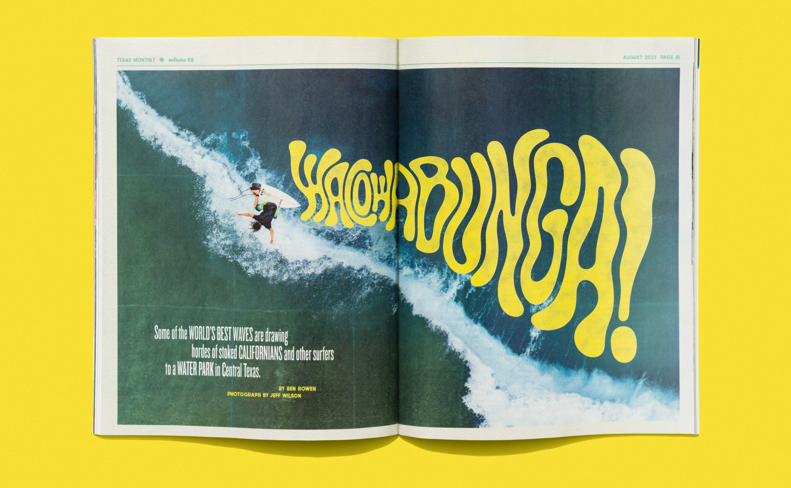
Surf Waco.
Last summer, Texas Monthly reached out with an assignment about surfing in Waco, Texas. That’s right, surfing in Waco, Texas. Who knew? Naturally, I was interested. My excitement grew when Emily (the amazing Creative Director at TM) included “vintage and trippy” in the brief—both delicious and dangerous words to tell someone like me. In addition to the juicy lettering direction, the backgrounds for these type treatments would be beautiful photographs by Jeff Wilson. It was time to get to work.
My role:
Create custom lettering treatments for the cover and full-page feature spread.
The process.
My primary goal was to create lettering treatments that oozed trippy vintage vibes and complemented the story and its excellent photography. To do this, I gave myself a list of words to check the designs against throughout the creative process:
- Trippy—ooey-gooey goodness that pushes legibility to the edge of its seat
- Vintage—carefree summertime vibes with the windows down
- Movement—the lettering needed to have fluid-like movement
From there, I proceeded with rough sketches to get a feel for the composition and stack possibilities. Once I had something worth looking at, I put them in front of the client. Some of these are shown below.
From weird to wonderful.
After the first review, it was time to tighten things up. This assignment was all about the balance between legibility and visual style. To make sure legibility didn’t hinder style, I intentionally pushed many treatments too far to ensure there was flavor to spare. In my experience, if you start too safe, you will never reach a result that pushes things far enough stylistically. From there, it was time to vectorize and apply an analog-like treatment that reinforced the vintage feel.

Aw, shucks.
Earlier this year, I was excited to learn that Communication Arts recognized our hard work with an Award of Excellence. Sharing CA’s pages with some of the most respected creatives in the world was a welcome surprise for a small-town kid like me. It wouldn’t have happened without everyone involved—shoutout to the fine folks at Texas Monthly for the opportunity.
