A typeface so wrong, that it’s juuust right. Earlier this year, my friends at Starmark reached out with an opportunity that grew into one of the most fun, ambitious, and rewarding projects of the year. They were looking to produce a custom typeface for Valencia College, a client of theirs that wanted to add a funky human touch to an upcoming campaign and its messaging. All in under a month—it was time to get to work.
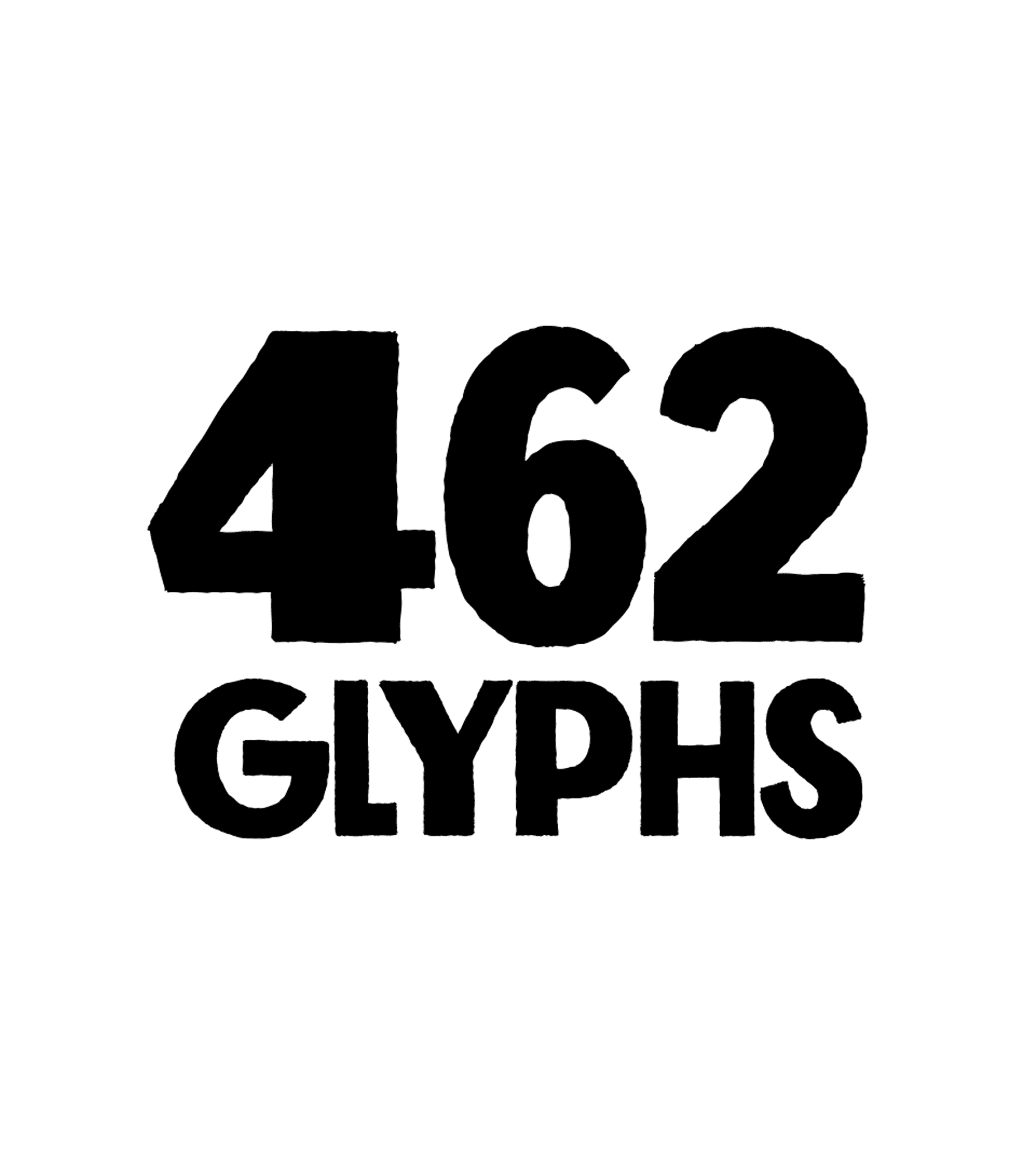
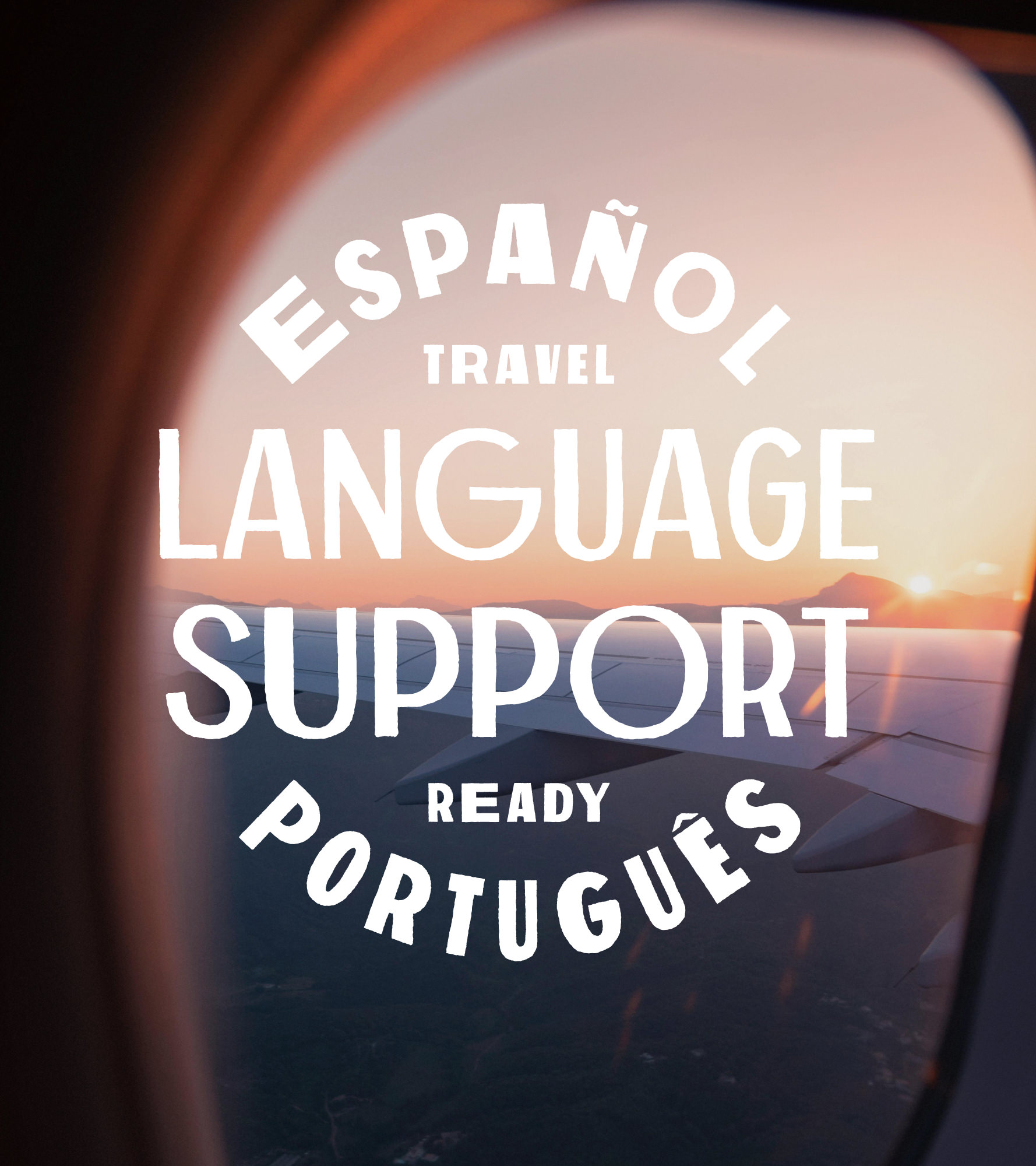
My role: Create an original typeface with two font weights, upper and lowercase, stylistic alternates, language support for Spanish and Portuguese, and two lettering treatments for “Puma” to be used in the upcoming campaign and future brand work. Lastly, these fonts needed to play well with Gotham, Valencia College’s workhorse brand typeface, using similar x-height, cap height, and descender proportions.
The process.
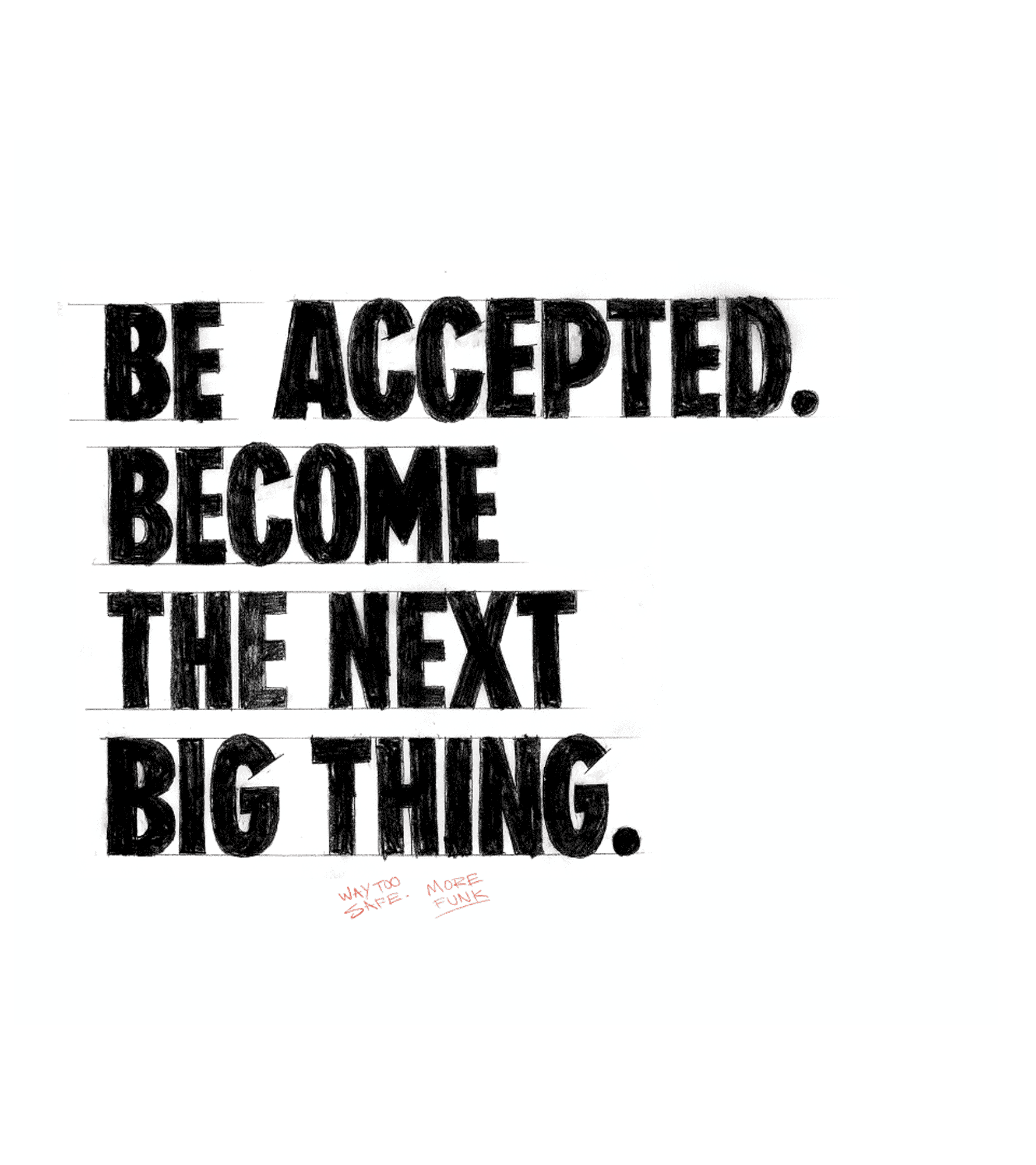
From the start of this project, we knew an authentic handmade feel was key. Because analog processes are time-consuming, it was important to nail down a structure using minimal copy. We did this using approved campaign headlines that enabled us to focus our time on the glyphs used in the headlines before expanding into complete character sets, different weights, language support, and stylistic alternates. This gave us a realistic glimpse into what the typeface would look like without spinning our wheels early in the process. From there, we made several beta fonts to use and test as we moved forward.
Filter Categories
Filter - All
Beyond the beta.
After several early beta versions of the bold weight, we finally had the feel locked in. It was time to build the full character set and begin the same sketching, inking, and scanning process for the book weight. This portion moved much more quickly, as the structure had already been established. From here, changes were minor and were primarily addressed within font software until finalized.
Filter Categories
Filter - All
Filter Categories
Filter - All
Whew, that was fun.
It’s wild to look back and think this work was completed in less than a month. I knew from the onset of this project that speedy reviews and good communication were paramount to its success. Thanks to the Starmark and Valencia College crew, we could easily charge forward and stick to the aggressive timeline. I can’t thank them enough for such a fun opportunity and for being so great to work with.
If you have questions about this job or the font creation process, please don’t hesitate to reach out. I would love to talk type.