Texas Monthly.
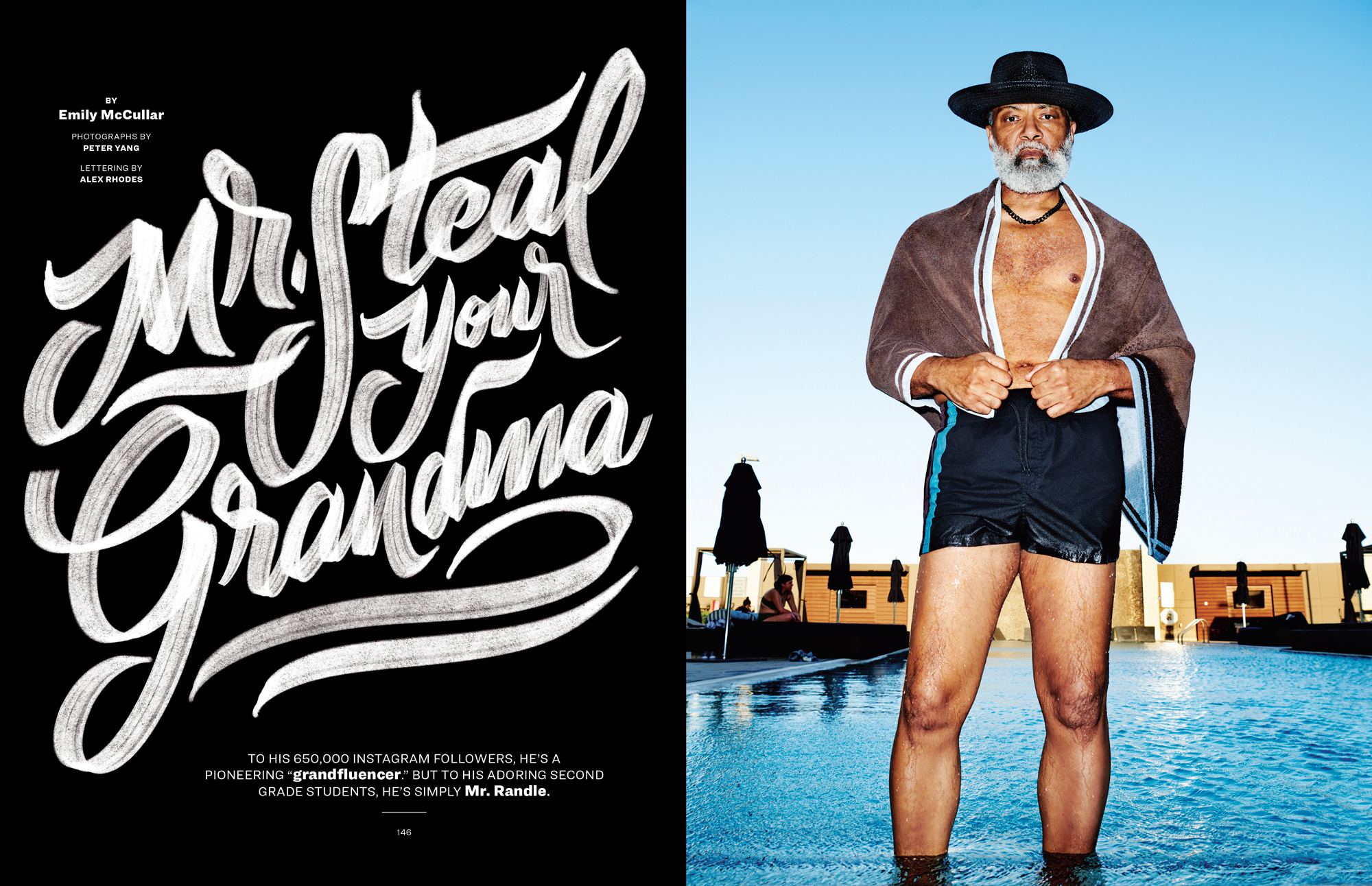
Last summer, Texas Monthly reached out about an upcoming project featuring Irvin Randle, a 60-year-old teacher and “grandfluencer” known as “Mr. Steal Your Grandma.” When Emily (the amazing Creative Director) asked if I was interested, my response was a resounding “giddy up.” This project had all the ingredients for creative goodness. Great direction, an engaging story, fantastic photography, and the need for some tasty lettering to bring things together. It was time to get to work.
My role:
Create a full-page lettering treatment for the feature spread and a supporting spot treatment for an interior page using the same style.
The process.
My primary goal was to create something that complimented the great story by Emily McCullar and the stunning imagery by Peter Yang. To do this, I gave myself a list of words to check the work against as I moved forward:
- Loose—nothing too ridged
- Confident—a touch of swagger but nonchalant at the same time
- Attitude—a little bite
From there, I proceeded with rough sketches to get a feel for the composition and stack possibilities. Once I had something worth looking at, I put them in front of the client.
The devil is in the details.
With an approved direction in hand, it was time to move on to high-fidelity design. Like most of my projects, I created high-resolution digital brushes to get the look I was going for. I made these from a collection of analog samples and scans. I wanted a dry brush feel to give a sense of grit without distracting from the flow of the piece.

Aw, shucks.
Earlier this year, I was excited to learn that Communication Arts recognized our hard work with an Award of Excellence. Sharing CA’s pages with some of the most respected creatives in the world was a welcome surprise for a small-town kid like me. It wouldn’t have happened without everyone involved—shoutout to the fine folks at Texas Monthly for the opportunity.
